

My Local Nest: Making Bonds, Shaping Communities
Connecting older adults through events, tech learning and volunteering.
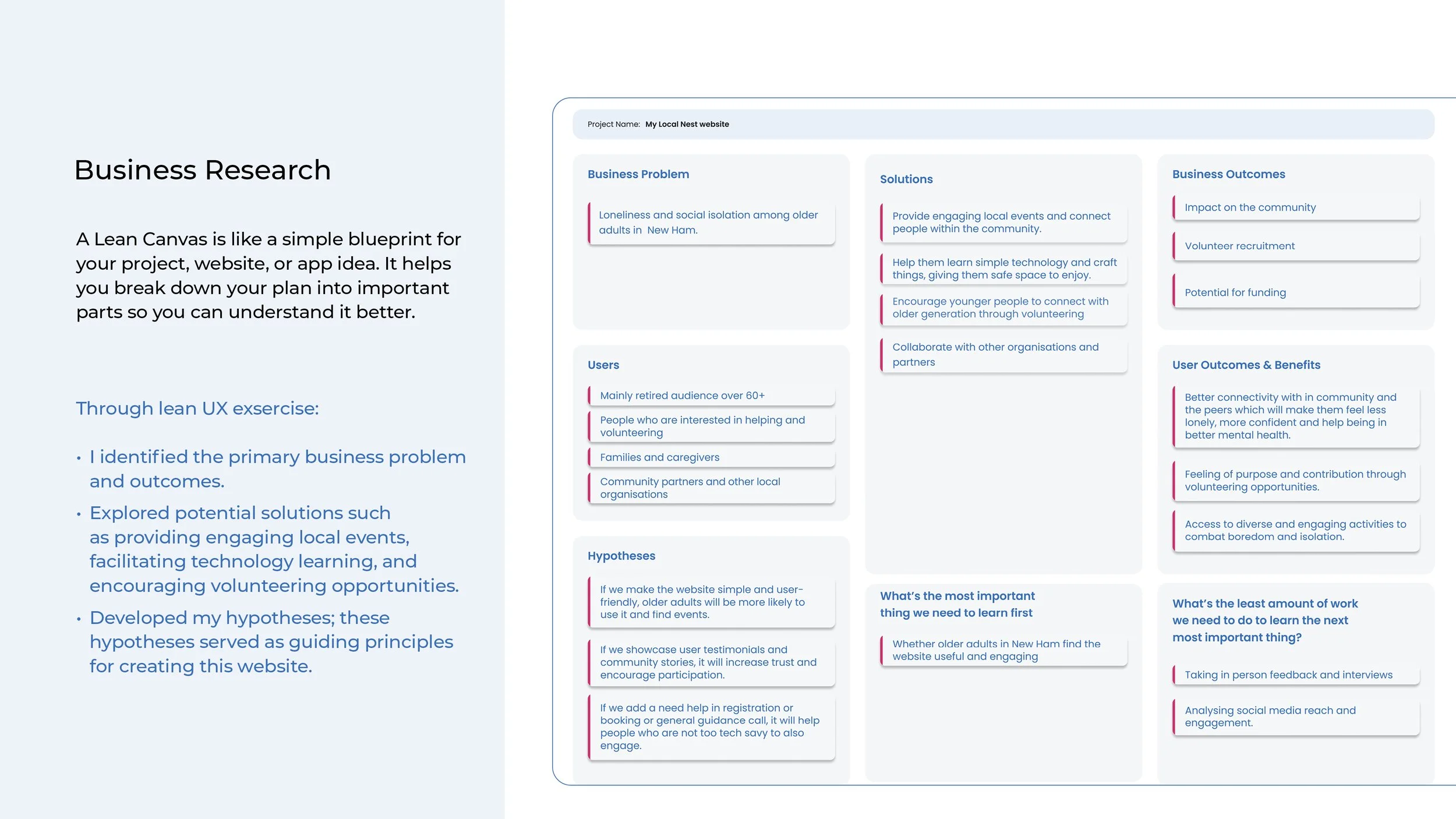
Project Goal: To create an accessible and user-friendly website for seniors (60+) to foster community connections, ease loneliness, and enhance confidence.
Personal Goal: To gain a thorough understanding of website development covering: user research, business needs, UI components, style guide, wireframes, and prototypes.
Role: UXUI Designer Personal project

Design Process
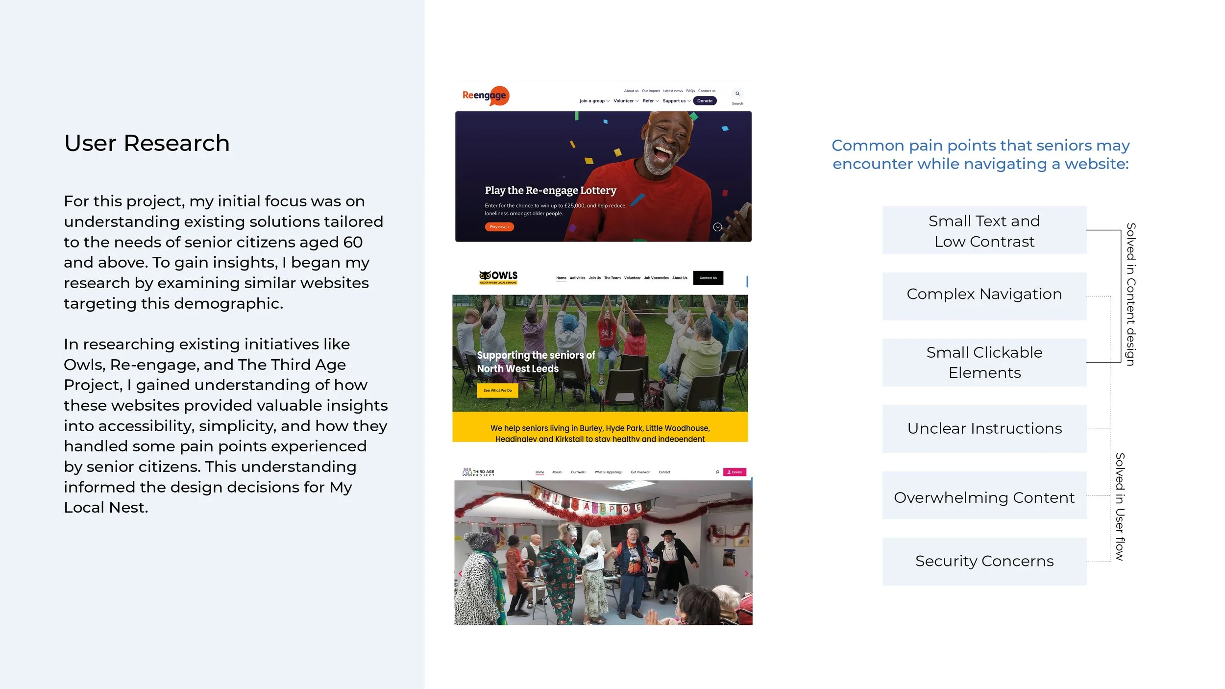
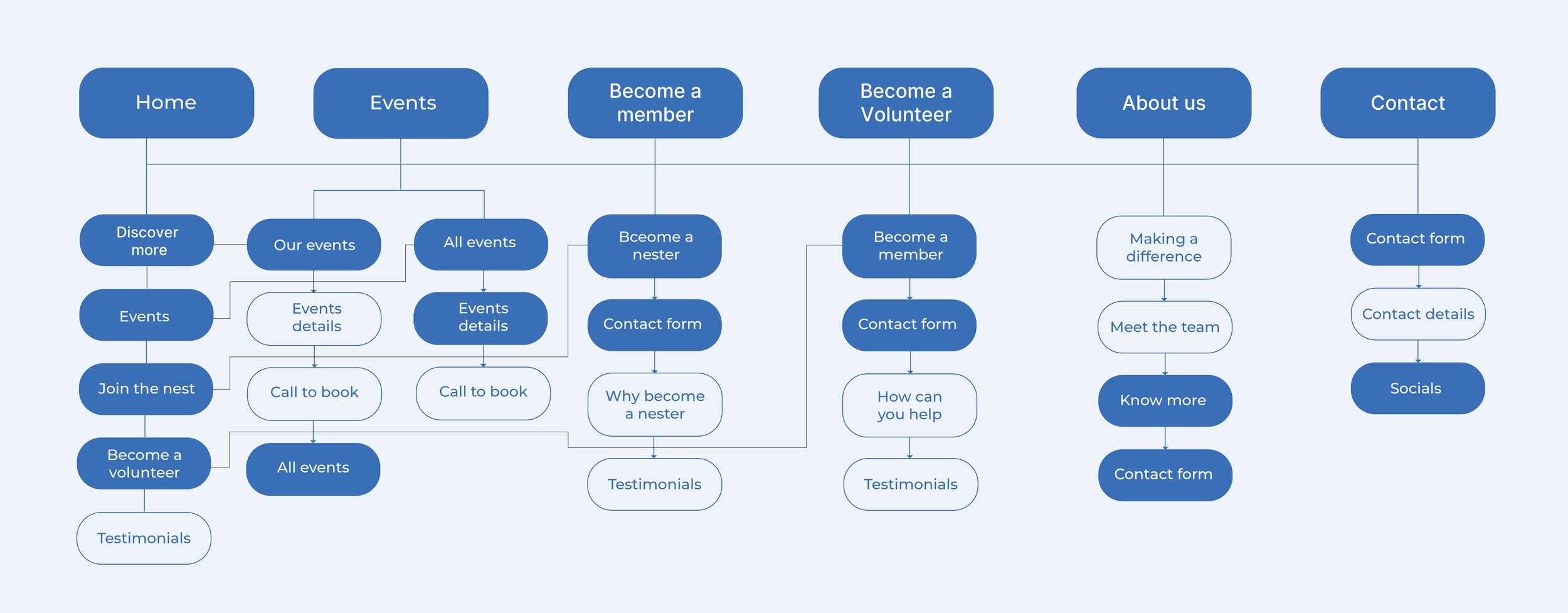
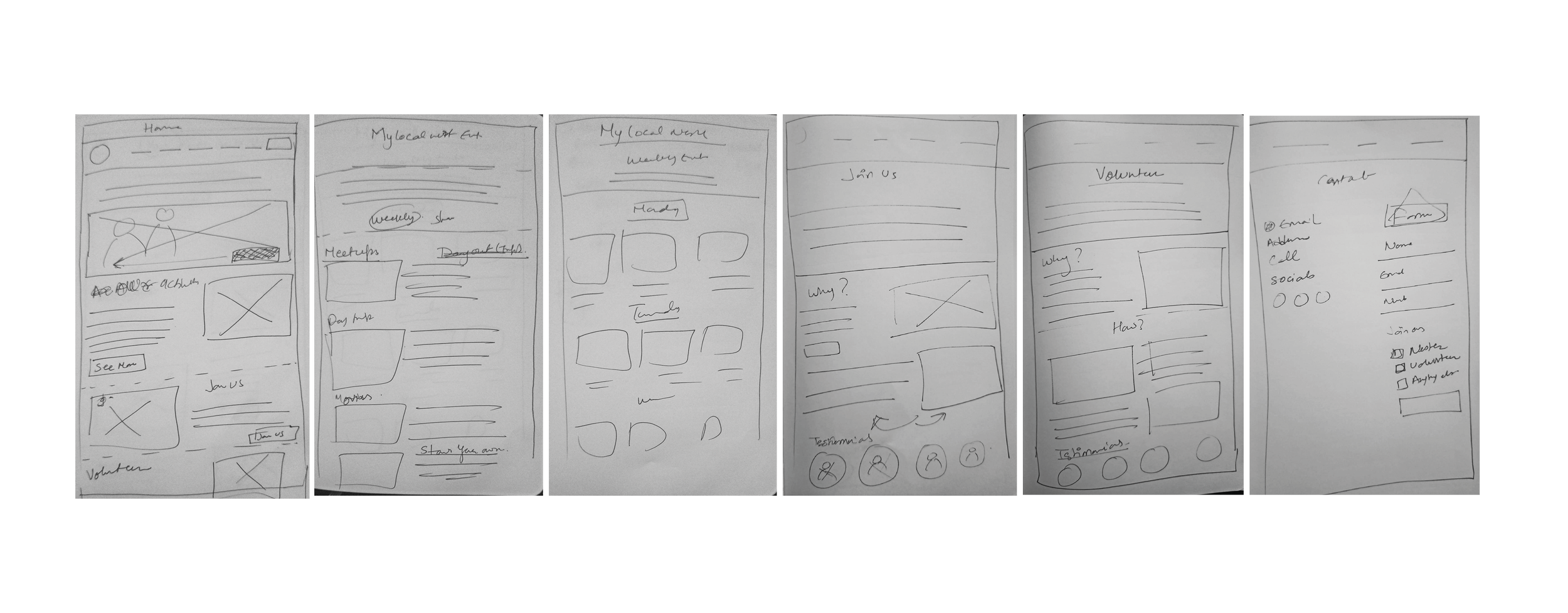
I created a simple and minimal navigation site map that allows users to access their desired page through multiple entry points. I focused on providing clear instructions for specific steps, such as ‘Call to book,’ considering that not all users may be comfortable with booking online or highly proficient with technology.
Site Map
Visual Identity Design
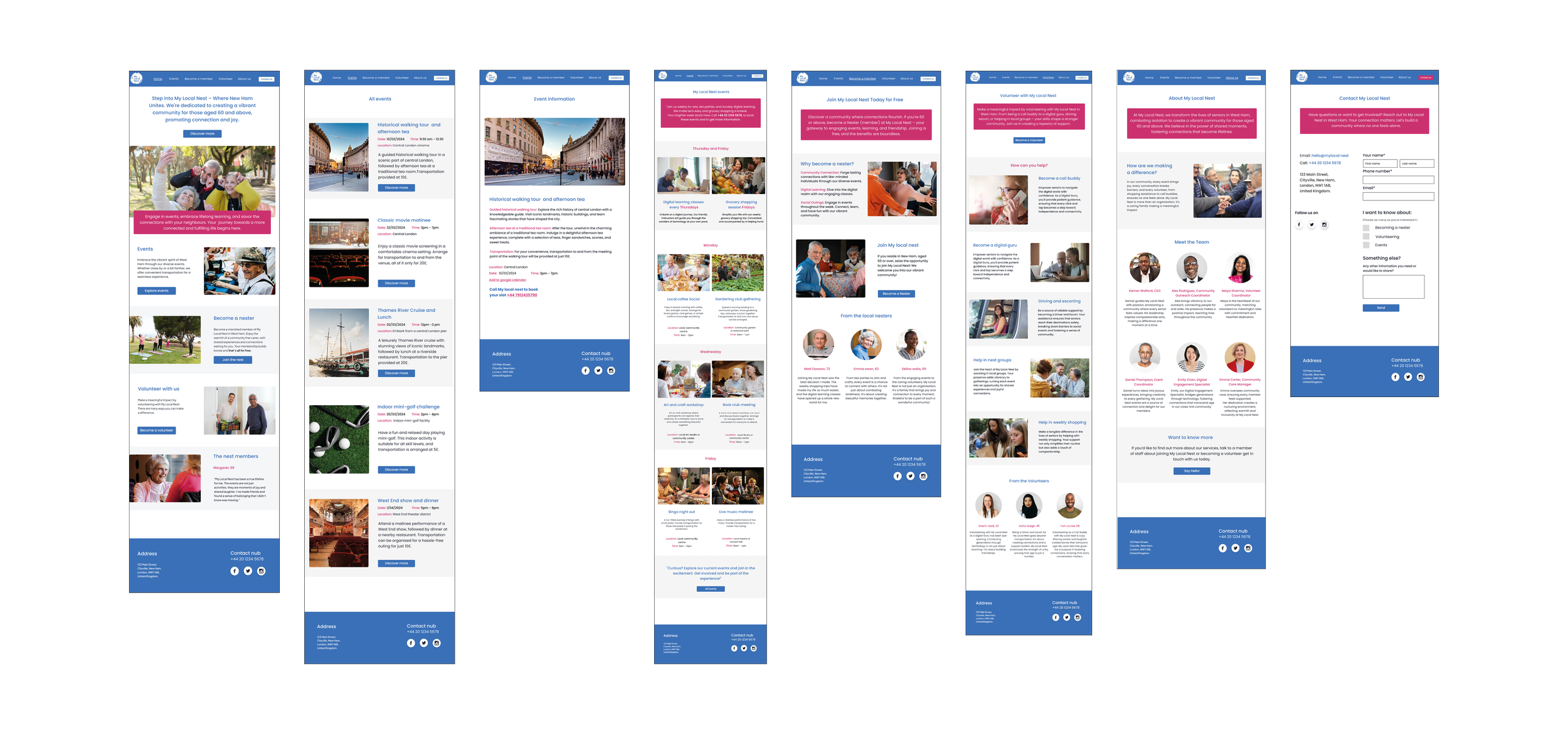
I created the entire branding, starting from the logo, to capture the feel and essence of My Local Nest. I chose an easy-to-read typeface and selected colors with accessibility in mind.

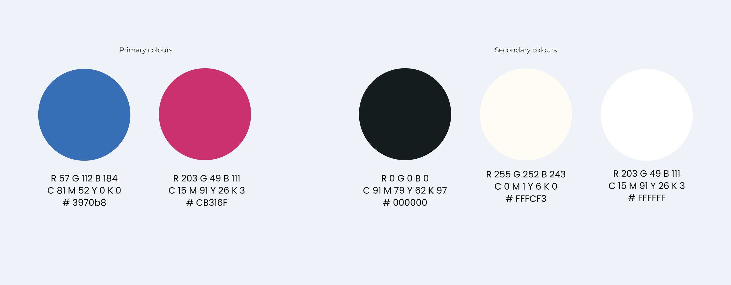
For primary colors, I chose blue and pink because they align well with My Local Nest’s values. Blue represents trust and security, while pink evokes feelings of warmth, kindness, and care. On the website, I used blue (Primary Color 1) for titles and call-to-action buttons, and pink (Primary Color 2) for other important and supportive information. For the secondary colour palette, I kept it simple with off-white, white, and black.
Colour Palette
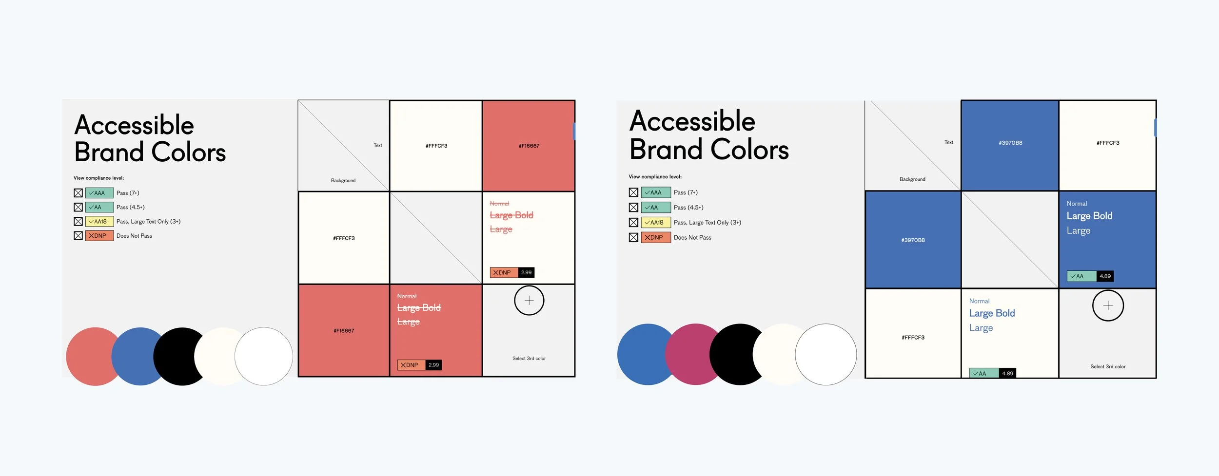
Choosing the right colours for this project posed a challenge, given myaContent Accessibility Guidelines to grasp the importance of contrast ratios and high contrast colours. Initially, I selected coral as my primary colour, but later switched to blue as Primary Color 1 and pink as Primary Colour 2, after testing it in abc.useallfive.com ensuring they maintained a high contrast ratio for improved accessibility.
Colour Accessibility
For clarity, I avoided using different typefaces and stuck to using only Poppins in various font sizes. I ensured plenty of white space for better readability and used primary colors for titles and call-to-action elements, reserving black for other body text.
Typography
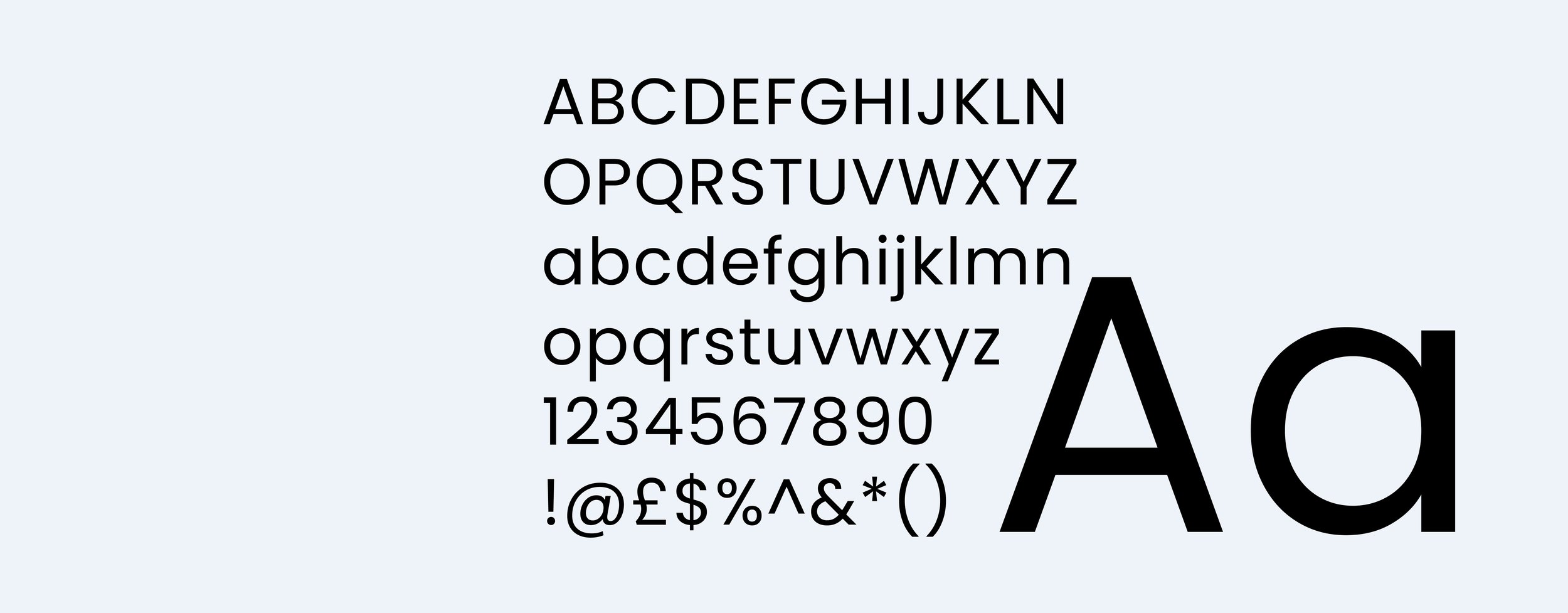
Poppins
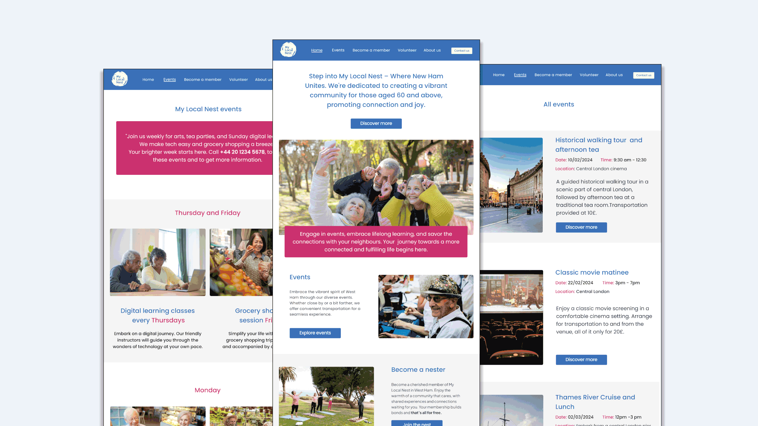
Low Fidelity Wireframes
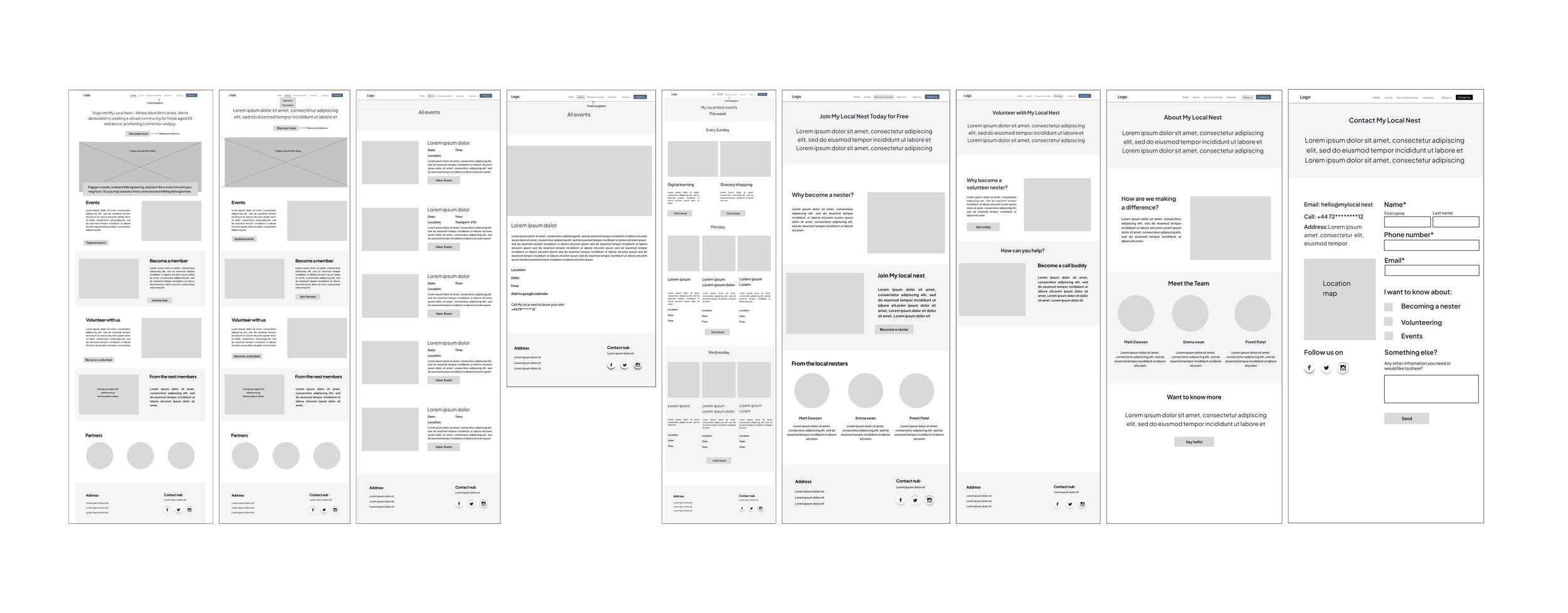
High Fidelity Wireframes

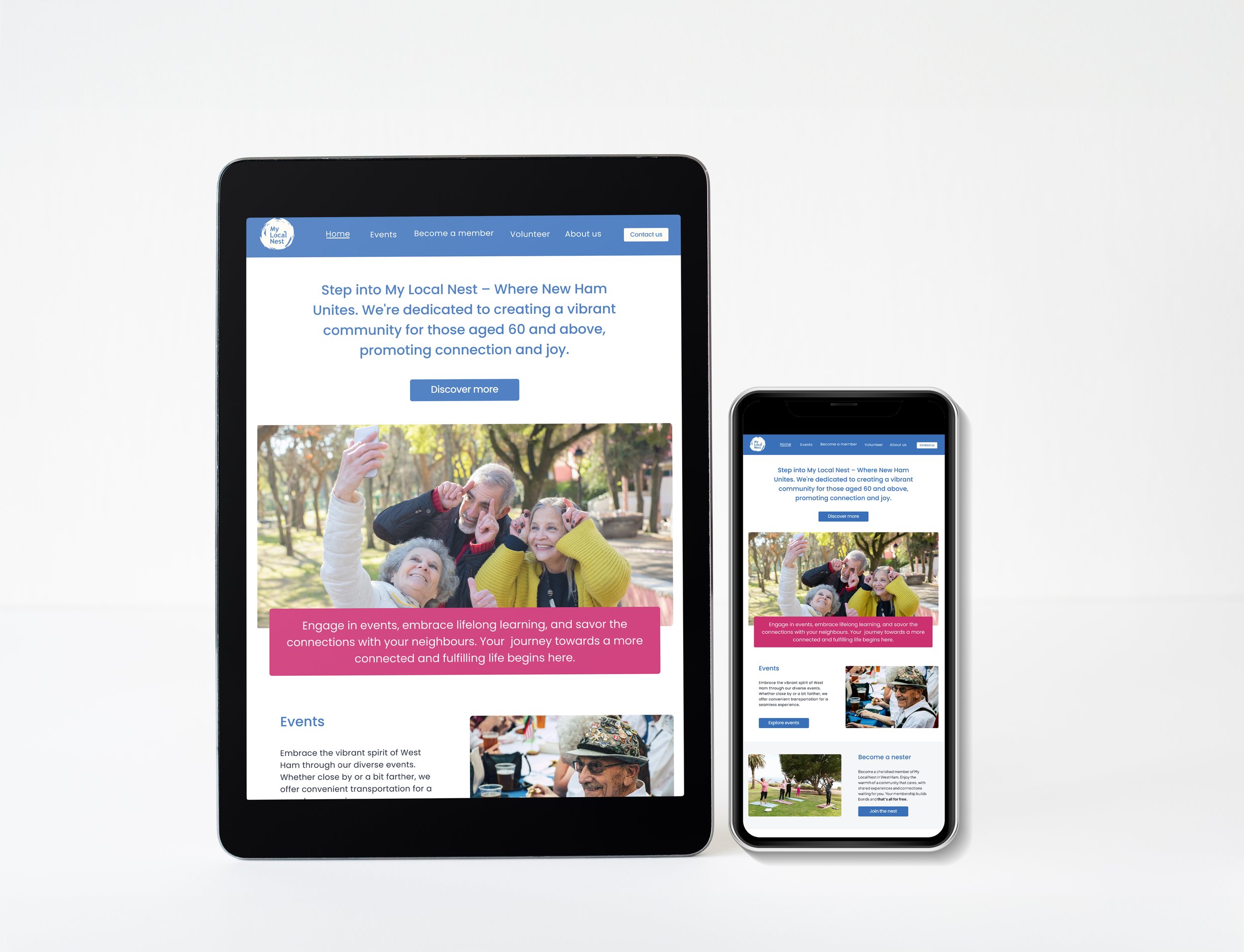
Prototype